Refugee Health Alliance
Refugee Health Alliance (RHA) is a nonprofit that provides medical care to refugees and vulnerable populations at the US/Mexico border. RHA’s website needed logo branding materials, a website redesign, and social media revamp. RHA’s website needed logo branding materials, a website redesign, and social media revamp.
Role
UX Researcher
Duration
June 2022, 10 weeks
Team
Haeun (Madison) Kim - UX Researcher
Freshta Ehsan - UX Designer
Frances Sy - Marketing + Content Strategist
Thoa Nguyen - Visual Designer
Hasan Alsamman - Web Developer
User Research
In order to understand and gain insight into our user base and their opinions on RHA’s current website, our team conducted a survey. We gathered 18 responses from RHA users and 7 responses from non-RHA users (public audience).
1. What age range are you in?
2. What made you decide on volunteering/donating at RHA?
3. On a scale of 1-5, how easy is it to navigate through RHA’s website?
4. On a scale of 1-5, how would you rate the overall look of RHA’s website?
5. On a scale of 1-5, how would you rate the clarity of content used on the website?
6. What feature(s) do you like the most on RHA’s website? Select all that apply.
7. What feature(s) do you dislike the most on RHA’s website? Select all that apply.
8. Which of the following statements do you agree with? Select all that apply. If you selected one or more of the options in the previous question, could you elaborate on why you have selected them?
44% of respondents thought the clarity of RHA’s website is a 2/5
44% of respondents thought the ease of navigation is a 3/5
55% of respondents said they often find themselves lost when navigating through the website
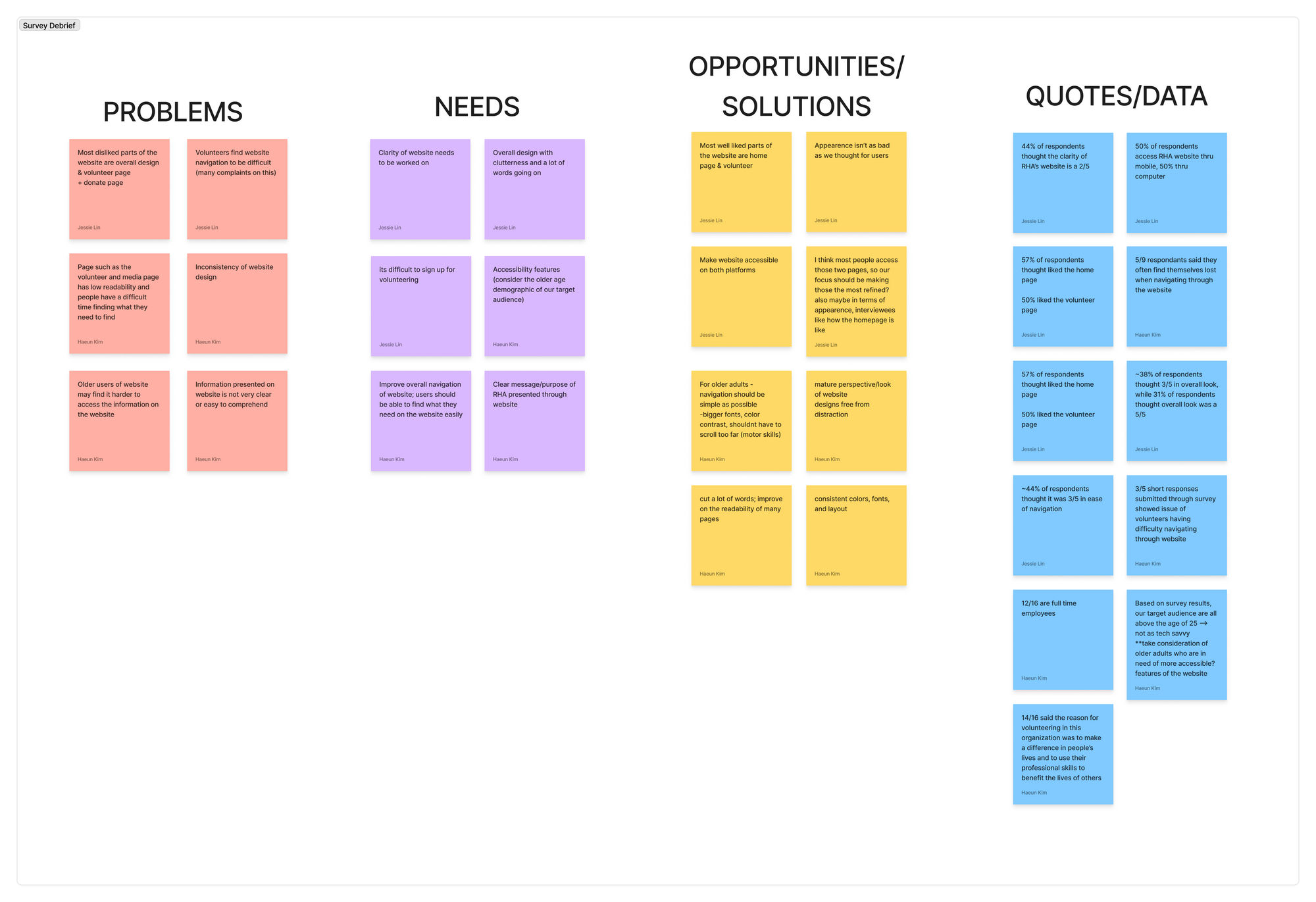
Our user personas are based on our survey, as a representation of our target users.

Summary of Findings
Original website is overall difficult to navigate.
Poor and confusing readability mainly due to lack of simplicity and conciseness of information presented.
Poor and confusing readability mainly due to lack of simplicity and conciseness of information presented.
3/5 short response survey results voiced complaints regarding the volunteer page.
Designing-the-Product
Design Goals
1. Create an accessible, functional, and interactive website that is easy-to-use for users of all demographics.
2. Condense the website content, organize the website for better navigational purposes, and prevent any user issues.
Wireframing
Taking into consideration what our stakeholders were open to changing along with considering the survey data we’ve collected, we created sketches and wireframes soon after. We reorganized the information hierarchy of the navigation bar and set an organized layout that is more accessible and consistent.
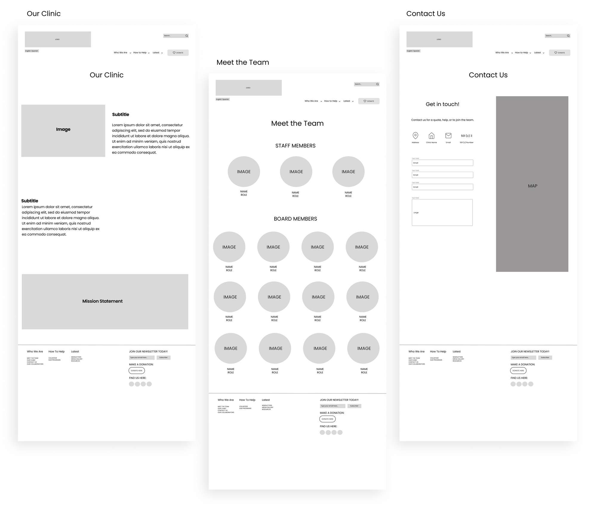

Lo-Fidelity + Mid-Fidelity Design
Based on the deliverables of our stakeholders and our own vision, we constructed a Lo-Fi / Mid-Fi prototype consisting of all the screens within the website. We mainly focused on the re-organization of the website during this phase.
Usability Testing
We wanted to test our design choices would be beneficial for someone navigating the website, thus we conducted eight interviews.
Key Findings
1. 5/8 described website’s initial impression as clean and simple
2. Average rating of website experience was 4.5/5Mainly due to easy navigation with no major struggles or hiccups
3. 6/8 mentioned confusion with how the navigation bar tabs are organizedResources task : resources tab was not where they expected it to be under
4. Want better organization and naming of tabs
Hi-Fidelity Design
We were able to merge into our Hi-Fi prototype where we implemented a new color palette, typography, and more specificity from the Lo/Mid-Fi prototypes. We heavily considered the research derived from our user interviews in order to address and correct anything noted by our participants. We were able to use that information to create additional screens, change wording content, and re-organize where certain screens were found in order to constitute an easier flow for users.
Visual Design / UI
Logo Redesign
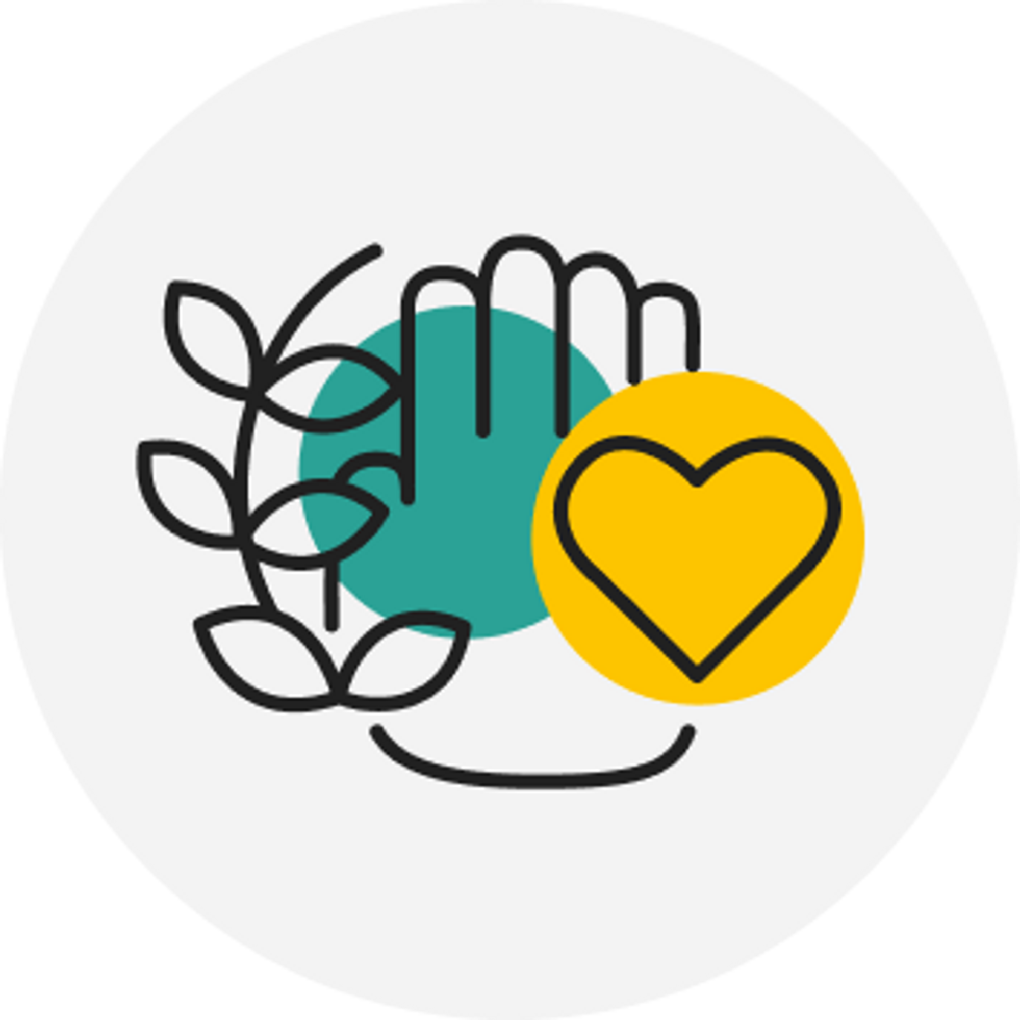
To build off on RHA’s original logo (left) as shown on the new logo (right), we drew a hand and a heart to symbolize support in critical times. The plant on the left symbolizes new life, growth, and health. This illustration combined with RHA’s primary colors helped further emphasize the look and feel that RHA promotes.
Style Guide
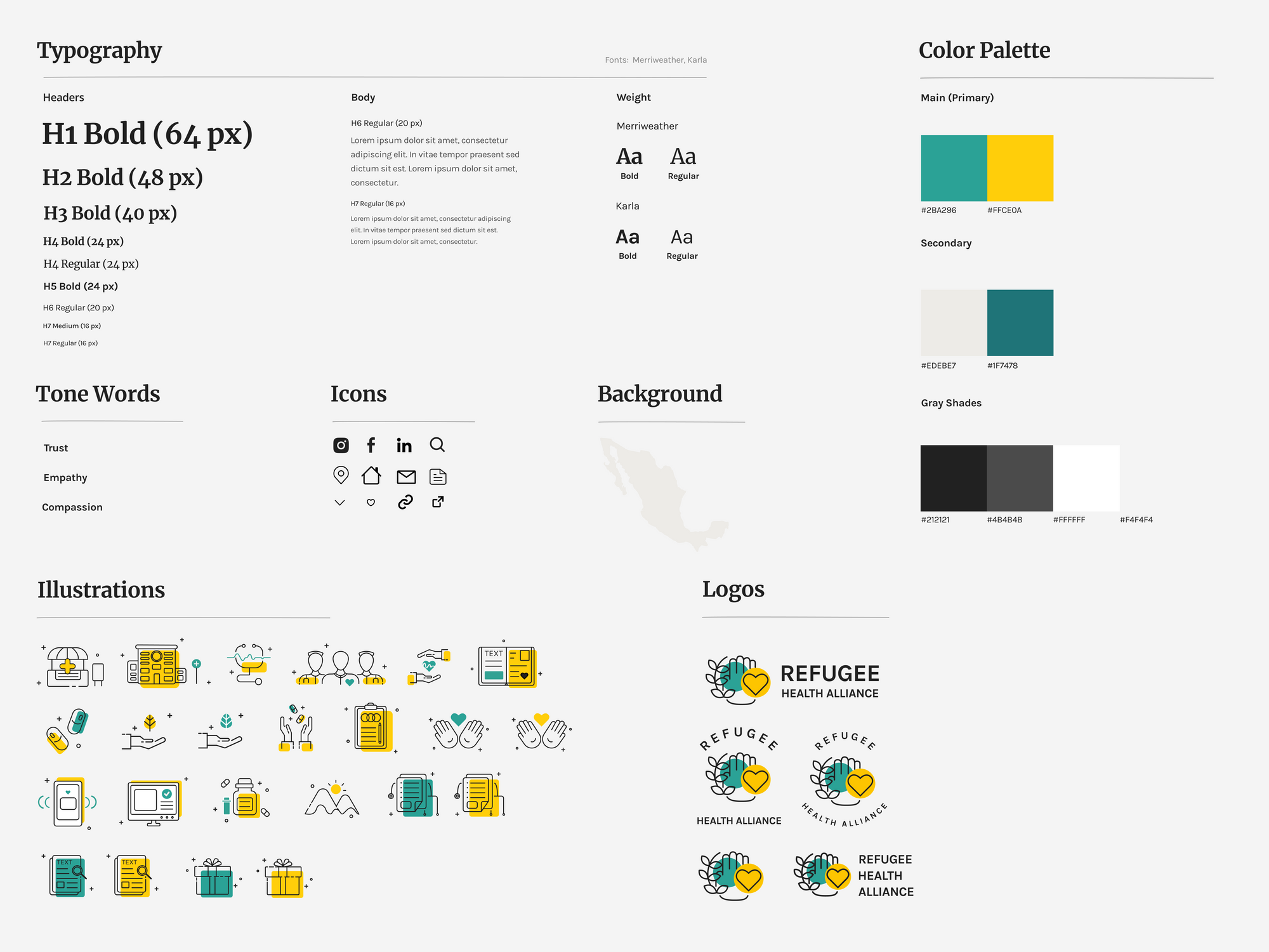
The style guide was curated in reference to RHA’s core brand personality and mission statement. RHA had a long history of using the colors turquoise and yellow to symbolize trust and compassion as a health-care oriented nonprofit, so we built off that foundation to emphasize what they stand for.

Final Design
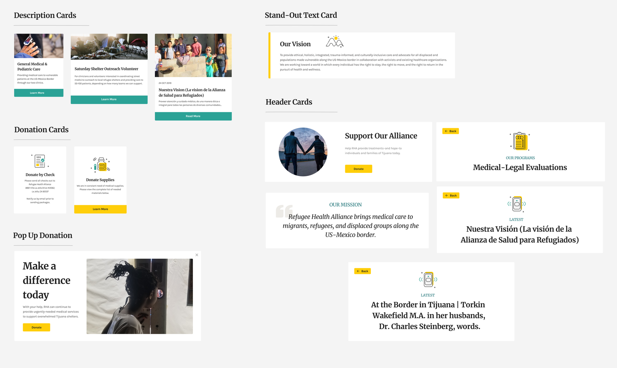
Our final prototype consisted of some new changes in which our stakeholders and mentors provided more recommendations. Additionally, we implemented more screens that were previously difficult to locate in the original website, finalized the word content and photos, and redesigned the navigation bar in order to reflect an easier way to find certain pages.
Reflections
Although we had the individual roles that we were assigned, we supported one another and split the workload amongst the other team members. It would’ve been too much work to assign just one person with all the heavy-duty work of creating approximately 50 screens to navigate through all aspects of what RHA has to offer. We took on responsibilities and created an environment where we could depend on one another to complete this project.
Next Steps
For future steps, we will continue to implement our design into Wix, which is the web builder RHA was familiar with. Along with that, we will launch for social media a consistent template with multiple options that RHA can use in the future.
If we had more time, we would finalize RHA’s latest section and research other ways to organize the information so users can easily navigate through the site and not feel too overwhelmed.
Acknowledgments
We want to thank Refugee Health Alliance; the Build Up organizers; our mentors Sejal, Paula, and Sabrina; the other Build Up teams; and all the other people who supported us in making this project happen. We thoroughly enjoyed working on this, challenging ourselves, and being able to help the community.
Let's Connect!
I'd love to grab some coffee and chat!