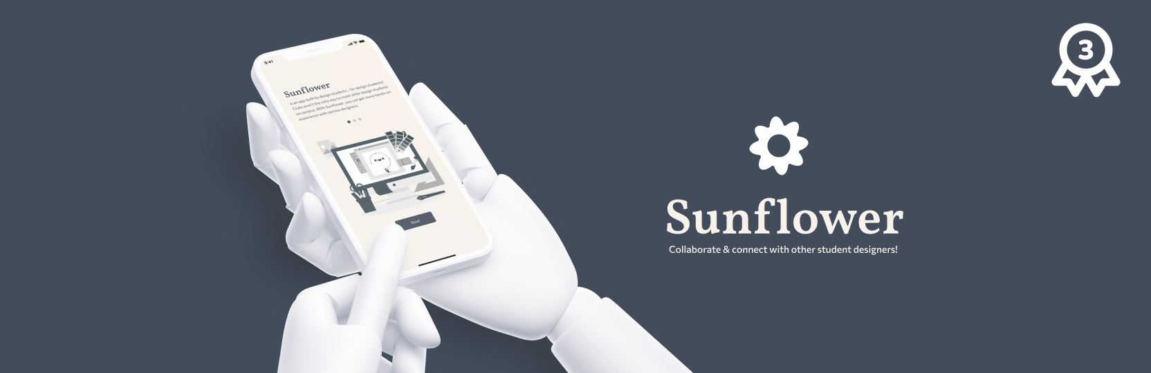
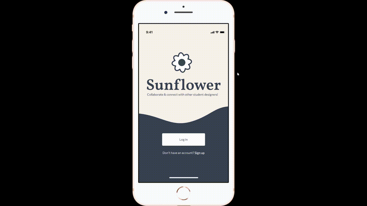
Sunflower
I was challenged to design a website or app that will help connect the design community at your campus while competing in UCLA ACM's "I for Design" Designathon. My teammate and I crafted Sunflower, an app to bring design students together through project collaboration. We placed 3rd at the designathon and fine-tuned the designs for another week to develop a more comprehensive project.
Role
Product Designer, UX Researcher
Duration
February 2022, 5 days
Team
Taylor Che
DESIGN BRIEF
The main design concept is to bring together members of the design community from a wide range of different experience levels. There are three components of functionality to support this concept:
01. A way to pair / group designers with other designers
02. A way for designers to see + post side projects
03. A way to connect both parties of designers
DESIGN PROCESS
01. Framing the Problem
Competitive Analysis & User Research
There were a lot of difficulties and barriers to entry for design clubs at our universities. Clubs were exclusive, taking in small numbers of students to do projects/sprints. Instead, we aim to create an inclusive app that would allow any design skill level to join. We compiled the design clubs on campus, comparing our friends’ experiences with these clubs
We sent out surveys to product designers on campus, gathering our target audience’s experiences to meet their needs. The surveys identified a lack of collaborative spaces on campus because clubs were too competitive to join, and campus events dedicated towards designing products tend to have too short of a timeline to develop a full case study.
From our surveys, we found that:
• 37.5% of designers were very engaged with campus clubs
• 75% of designers enjoyed & partook in collaboration
• 75% had difficulty finding a design community on campus
• Different methods of collaboration were used across the board
After conducting a total of 16 surveys, we analyzed our findings through affinity mapping, finding any overlap in different people’s needs.
02. Framing the Problem
Personas
Using our survey findings, we also reated two general user personas to help us empathize with our users, based on product design students.


Comparing Design Concepts

Calendar
A calendar for campus events related to design workshops, speaker events, fun design activities, networking activities, etc.
Cons: Less opportunities for collaboration through the app. Workshops tend to be repetitive, so little opportunities for growth as a designer.

Social App
A social app for finding and pairing design students with other design students based on their preferences.
Cons: Issues can arrive when a student doesn't complete the task

After consulting with mentors and three other design students, we collectively agreed that the social media app would be the optimal choice between our two solutions. This app would enable student designers to connect and communicate with others who share similar passions, fostering mutual growth by collaborating on projects.
03. Finding a good solution
Key features to build
From the users' pain points and my notes from my competitive analysis, I designed several flows with our wireframes, including navigating how a user could join a project with other designers. This helped us to design wireframes consisting of our main features.
04. Refining the solution
Making iterative changes
We tested the app with our mentor and 3 student designers to ensure that the product's experience was seamless, while making iterative changes along the way.
Making iterative changes
We tested the app with our mentor and 3 student designers to ensure that the product's experience was seamless, while making iterative changes along the way

CHANGE #1
Our user testers noted that the questionnaire felt endless, and it would be nice to see the amount of questions in total. To remedy this, I designed a progress bar for each screen throughout the questionnaire.
CHANGE #2
It wasn't immediately obvious to our user testers that certain design vocabulary words were clickable. I designed it so that specific words leading to a link/ pop-up had clearer indication of this function by changing the colors of the text according to our brand guidelines and adding a little "?" icon.


CHANGE #3
I redesigned the entire "Join a project" page because users indicated that they would have liked to search and find a variety of projects, other than the recommended projects. Changes included a search bar, a filter system, and more categories to browse through.
CHANGE #4
After my decision to include a filter system, I designed a "Filtered Search" page, so users can have direct control over what projects they'd like to view from their homepage.

Final Design
IMPACT
Next Steps
• More user research to create a more seamless experience
• User test emphasis on finding project members, rather than projects
• Implement a feedback system, either through mentorship or from peers
• Have yet to address what happens when a user doesn’t finish the work
• Create clearly defined icons with labels
• Better adhere to WCAG standards
Takeaways
My first takeaway is to always seek feedback throughout the entire design process. Fortunately, this designathon experience provided us with opportunities to seek advice and feedback from more experienced peers. I would have liked to have taken advantage of this opportunity more, epecially during the research process.
As this was a five-day project, we noticed many things we could improve in the future. Design is never finished. There will always be way to make the app more accessible and bring more value to users.
Lastly, I learned to never limit myself to one solution. Creating good design is about the process, never the initial solution.
Let's Connect!
I'd love to grab some coffee and chat!